

Best caption styles for TikTok Reels Shorts
Best caption styles for TikTok, Reels, and Shorts: timed hooks vs static reads, safe area, then burn before platform auto.
Best caption styles for TikTok, Reels, and Shorts are job matches: timed Snap or Reveal when words are the hook, static Classic, Paper, or Ink when speech only needs reading.
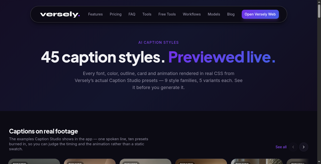
The platforms share mute autoplay and hostile chrome (username, buttons, progress). They do not share one "winning" yellow bounce. Preview live on caption styles, then burn with the AI caption generator or free burn captions so the first second already reads.
 Same kit across platforms beats a new default every post.
One kit, three surfaces
Treat TikTok, Reels, and Shorts as one caption kit with shared rules:
- Safe area. Keep the lower-third clear of platform UI. A perfect style under a username is unread.
- Contrast. Moving plates kill thin fills. Stroke or card is not optional on outdoor footage.
- Consistency. Viewers should recognize your type before your handle. CapCut-default spam trains them to swipe.
Retention-focused picking is in best caption styles for retention. CapCut default comparisons are in caption styles vs CapCut defaults. Font survivors are in video caption fonts for short-form.
TikTok: words often perform
TikTok mute scrolls reward punchy timed captions on listicles, prices, and "wait for it" lines. Use Snap or Reveal on the open, then fall back to static if the clip runs long. Pair with faces that feel native (TikTok Sans on Classic / Reveal) when you want the feed to feel local, not branded brochure.
Burn before upload. Relying on in-app auto means late text and someone else's font. If you are selling local retainers, burned captions are part of the chore you remove for the owner (local business content retainer).
Reels: brand fit still loses to readability
Reels teams often force logo fonts into captions. Mute viewers bounce. Prefer a readable family from the hub, keep brand color as an accent, and save the wordmark for the end card. Caption fonts for mute scrolling covers why weight beats brand theater.
Paid UGC on Reels often wants a timed open for two seconds, then static for proof. Organic storytimes often want static throughout. Write the rule in the brief so creators stop guessing.
Shorts: hook gate first, style second
On YouTube Shorts, style cannot save a failed open. Fix the first moment using viewed vs swiped away (the Shorts hook gate), then apply a caption family that does not fight the face. Engaged views still track stay for monetization; public views from frame one can inflate bounce (engaged views meaning and engaged views and Shorts revenue).
Trend templates like the finger snap still need readable type on the after shot if you speak over the transform. Captions after the snap should not cover the payoff.
Burn path that ships
- Pick family on caption styles.
- Transcribe and burn via AI caption generator or add captions to video.
- Or burn a local SRT with burn captions.
- Phone-preview muted on bright and dark plates.
- Stop shopping presets for a quarter unless hold data says the family failed.
What I'd actually do
I'd lock two families per series (one timed, one static), keep one safe placement, and refuse weekly font redesigns. Same kit on TikTok, Reels, and Shorts. Export burned files so platform auto never becomes the product.
Sign up for Versely to preview styles on your footage and ship burned captions.
FAQ
What are the best caption styles for TikTok?
Timed Snap or Reveal when the words are the hook; Classic, Paper, or Ink when speech supports the picture. Preview on the caption styles hub and burn before upload.
Should Reels and Shorts use different caption styles?
Not usually. Share one kit. Adjust energy (timed open vs static body) by edit, not by inventing a new typeface per app.
Are CapCut defaults fine?
They are fine as a deliberate choice. As an accidental default they signal template spam. Compare looks in caption styles vs CapCut defaults and pick on purpose.