

Krea 2: Photoreal Images With Style References
Krea 2 review: photorealism that passes the squint test, plus style references that lock your brand's look. Workflows, prompts, and honest limits.
The way I test photorealism now is the squint test's opposite: I look closer. Skin at pore scale, the way denim creases at a bent knee, how afternoon light fringes through a glass of iced tea. Most "photoreal" models survive a glance and fail the lean-in — there's a waxiness, a too-even sheen, a suspiciously perfect everything. Krea 2 is the first model in my rotation where the lean-in regularly comes back clean. Its images have the imperfections of photography: sensor-like grain, believable skin, light that behaves like physics instead of rendering.
But raw photorealism is only half of why it's earned a permanent slot in my stack. The other half is style references: feed Krea 2 images that define a look — your past campaign photography, a mood board, a film still — and it generates new content in that visual language. Not similar-ish. In it. For brands with an established photographic identity, that's the difference between "AI images" and "our images, made faster."
Here's how I use Krea 2 in production, where it beats my workhorse models, and where it doesn't.
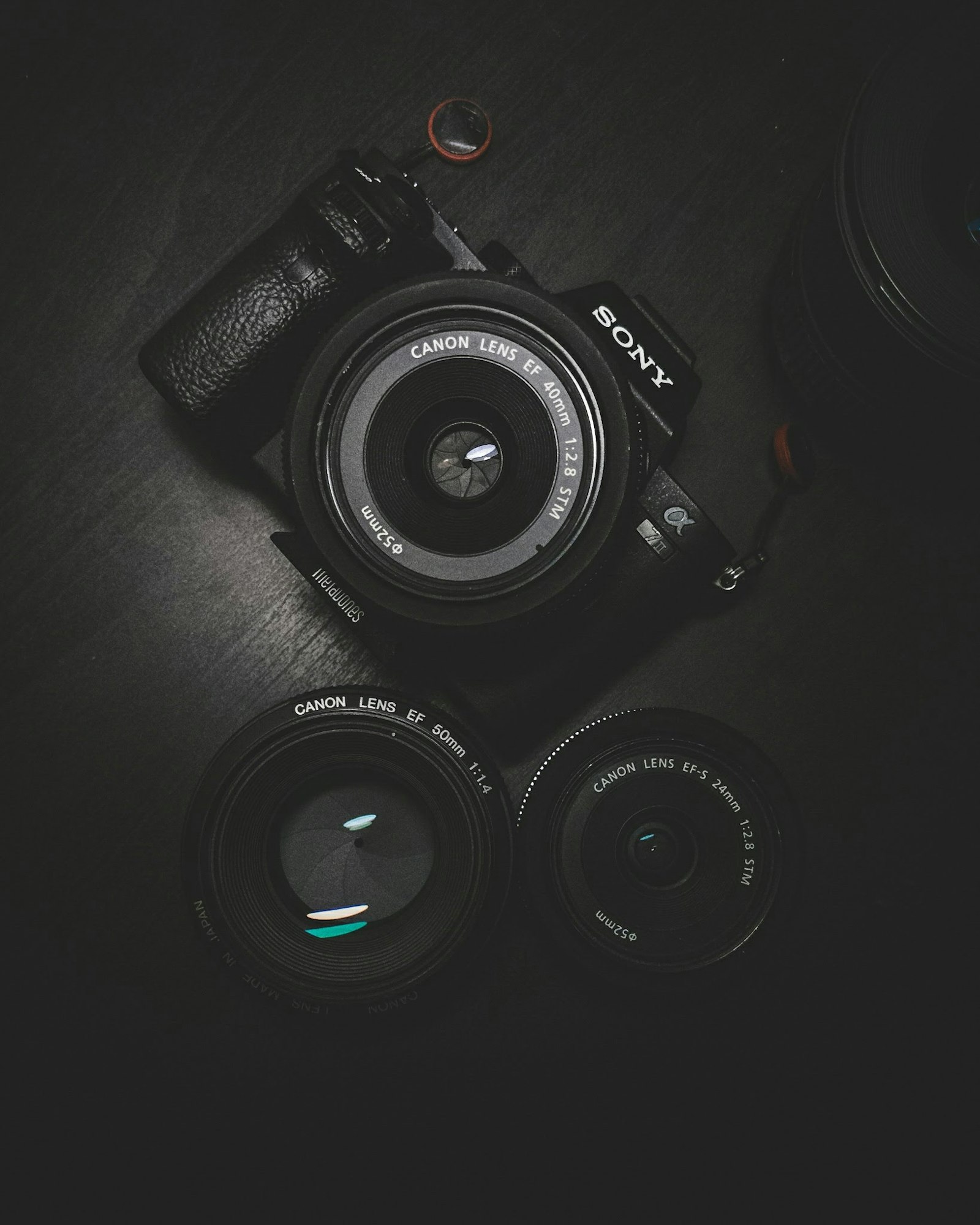
The photorealism, specifically
What separates Krea 2's realism from the field, from a month of lean-in tests:
- Skin. Texture variation, subsurface warmth, believable specular highlights instead of the airbrushed uniformity that flags AI portraits. People in Krea 2 images look like they have skincare routines, not shaders.
- Optics. Depth of field falls off like real glass; chromatic fringing and vignette appear in trace, plausible amounts. It renders a camera, not just a scene.
- Light behavior. Mixed lighting (window + lamp) resolves into coherent color temperature conflicts, exactly the messy way real interiors photograph.
- Material honesty. Worn edges, dust, fingerprints on steel — the entropy that makes a scene lived-in rather than showroom-dead.
The practical consequence: Krea 2 output survives contexts that scrutinize. Press-adjacent placements, founder-brand lifestyle imagery, anything where "obviously AI" costs credibility. That's a different job from the volume tier — my daily batch work still runs on Flux 1.1 Pro for its consistency economics — Krea 2 is what I reach for when the image will be looked at rather than scrolled past.
Style references: the brand-lock feature
The workflow that changed my client work: build a style reference set from a brand's existing photography — 3–6 images that capture their grade, light, and composition habits — and generate new scenes conditioned on it.
What transfers, reliably: color grade and palette bias, lighting character (hard/soft, warm/cool, direction habits), contrast curve, compositional density, and that hard-to-name "editorial vs commercial" register. What doesn't transfer: specific subjects, faces, or products — style references govern how it looks, not what's in it. (For locking a recurring subject, that's reference-to-video and character-consistency territory, a different tool for a different problem.)
Rules from doing this across several brand accounts:
- Curate ruthlessly. Reference images must agree with each other. One inconsistent image (a flash-lit outlier in a natural-light set) muddies the whole conditioning.
- References set the look; the prompt sets the scene. Don't re-describe the style in words — you'll create conflicts. Prompt subject, action, and framing only, and let the references carry the aesthetic.
- Version your reference sets. A locked set is a brand asset. Season refreshes get a new versioned set, not casual swaps.
- Mood boards work as pseudo-brands. For new brands with no photography, build the reference set from curated inspiration first, generate with it, then promote the best outputs into the next reference set. Two cycles in, the brand has a look that never existed before but is entirely consistent.
Krea 2 vs the field: routing table
| Job | Best pick | Why |
|---|---|---|
| Hero lifestyle imagery, press-adjacent | Krea 2 | Survives the lean-in |
| Match an existing photographic identity | Krea 2 | Style references |
| High-volume calendar batches | Flux 1.1 Pro | Median reliability, cost |
| Layout-complete graphics with copy | Seedream 5.0 Pro | Real typography |
| 2K stylistic showpieces | Grok Imagine | Raw resolution mode |
| Video anchor frames, premium clips | Krea 2 still → I2V | Realism carries into motion |
That last row is an underrated pipeline: a Krea 2 frame fed into image-to-video keeps its photographic character through the animation, and premium clips built this way read as filmed rather than generated. It's my default starting point for anything heading into the AI video generator at the commit tier. The full survey of where every image model currently sits is in the latest AI image models roundup and on the live model rankings.
Prompting for the photographic register
Krea 2 responds best to prompts written like a photographer's shot notes, not an artist's vision statement:
- Name the capture context: "shot on a full-frame mirrorless, 50mm f1.8" pulls sharper realism than any quality adjective.
- Embrace imperfection language: "slight motion blur in the background," "uneven window light," "candid mid-gesture" — instructions toward entropy are instructions toward realism.
- Skip the fantasy vocabulary. "Ethereal, stunning, hyper-detailed" push it toward the very renderiness you chose it to avoid.
- Keep one subject clause. Its photorealism concentrates; sprawling multi-subject briefs dilute the magic and raise re-roll rates.
Honest limits
- Cost and pace. It's priced and paced above workhorse tier. Wrong tool for 20-image batch days; right tool for the four images that matter this week.
- Typography. Middling text rendering — route copy-bearing layouts elsewhere.
- Stylized illustration. It can leave photorealism, but that's buying its weakest skill; dedicated stylized models do it better.
- Style reference drift on distant subjects. Ask a food-photography reference set for a car scene and the transfer thins. Style conditioning works best within shouting distance of the reference domain.
FAQ
What makes Krea 2 more photorealistic than other models?
It renders photography's imperfections — believable skin texture, real lens behavior, mixed-light color conflicts, material wear — rather than an idealized clean scene. Output survives close inspection, which is the actual bar for placements where "obviously AI" costs credibility.
How do Krea 2 style references work?
You supply 3–6 curated images defining a look; the model generates new scenes in that grade, lighting character, and compositional register. References control how images look, prompts control what's in them — don't re-describe the style in words or the two will fight.
Can Krea 2 match my brand's existing photography?
Yes, if your photography is consistent — that's the killer use case. Build a reference set from your best past shoots and new generations inherit the identity. Inconsistent reference sets produce muddy results, so curate hard.
Should I use Krea 2 or Flux 1.1 Pro?
Both, routed by stakes: Flux 1.1 Pro for volume calendar work where median reliability wins, Krea 2 for hero images, style-matched brand imagery, and stills feeding premium video. Most weeks my split is about 80/20 by count and the reverse by importance.
Krea 2 is live in Versely's text-to-image studio — upload a style reference set from your best past work and see your brand's look generate itself. A $1 pack is enough to try it.